Ocaso
A complete brand illustration library for the Spanish insurance giant Ocaso, developed as part of a refresh of the brand by Erretres.
Client:
Year:
Ocaso
2024
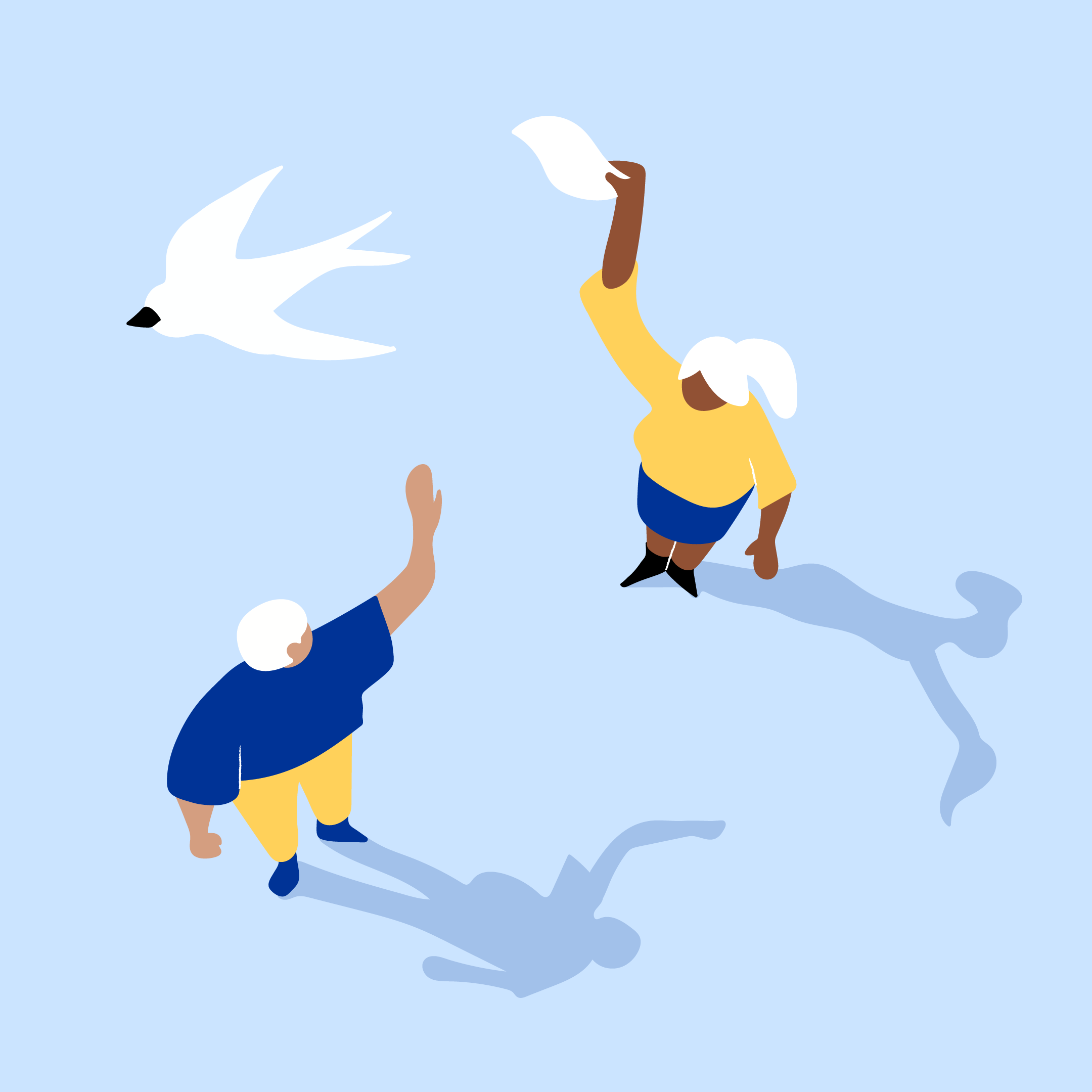
We created a series of minimalist illustrations: the characters have almost no features and their hands and feet are reduced to simple forms. Organic shapes counterbalance the minimalism, giving the illustrations a certain warmth.


We also created illustrated icons, where the minimalism was pushed even further in order for the illustrations to work at a smaller size.
The pieces could be seen on buses all over Spain, and on a large billboard in the Glorieta de Bilbao, in central Madrid. In addition, they were featured all across Ocaso’s website and their physical branches.
The illustrations were created with a bird's-eye view, giving them their own personality. This allowed us to play with shadows, which were elongated like those produced by the sun at sunset ('Ocaso' translating to 'sunset' in English). The shadows also helped to give the illustrations a three-dimensional quality.
We primarily used the brand's two main colours (yellow and blue) and complemented these with secondary colours such as coral, black accents, and lighter variations for the backgrounds. Cool shadows were used on the blue backgrounds and warm shadows on the yellow backgrounds.


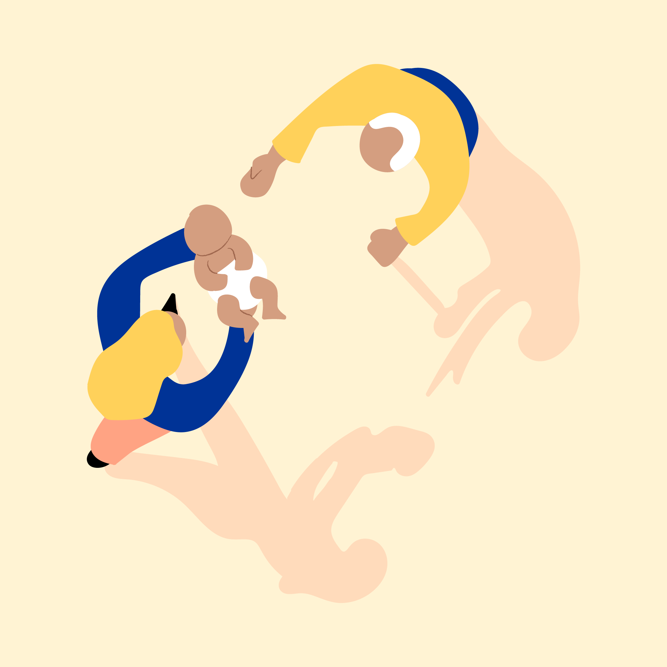

The illustrations were based on key concepts related to the Ocaso brand. Some of these were more literal, for example 'home insurance', and others more abstract, for example 'peace of mind'.
In total, the project consisted of 77 illustrations (36 small and 41 large), with the large illustrations also developed in both color variants.


Let’s work together
For project inquiries, please fill out our contact form or send an email to hello@beclay.com


